Hello, friends,
Customers in the shop have been wondering how to choose beautiful combinations for their Fade projects. Since putting complementary colors together is pretty much my job, I’d like to share a few strategies I use when thinking about creating gradients.
There are three approaches I’d like to show you: gradient, balanced complements and color value.
Let’s start with gradients today. As you might imagine, the easiest way to think about a gradient is one basic color (say, blue) with one end very light, moving to a much darker shade of the same color. Check out the Tangled Up in Blue gradient yarn below.

When you’re picking out colors, having things in the same color family from light to dark tells a very coherent color story. If you have speckles that aren’t quite the same color, a great strategy is to look at the color’s value. Value means the light or darkness of a color on a grayscale.

These semisolid skeins are lined up in order of lightest to darkest by value. If you want to check your lineup of colors to see if it’s going from light to dark, line them up and take a photo with your phone. Then add the grayscale filter and it will show you the skeins’ value. Sometimes colors surprise you!

Let’s start with a nice gradient in the same color family. All of these colors have other elements, but they have green in common. Darkest to lightest, they’re What Kind of Bird Are You, Tiptoe Through the Tulips, Easy Being Green and Growing Like a Weed.
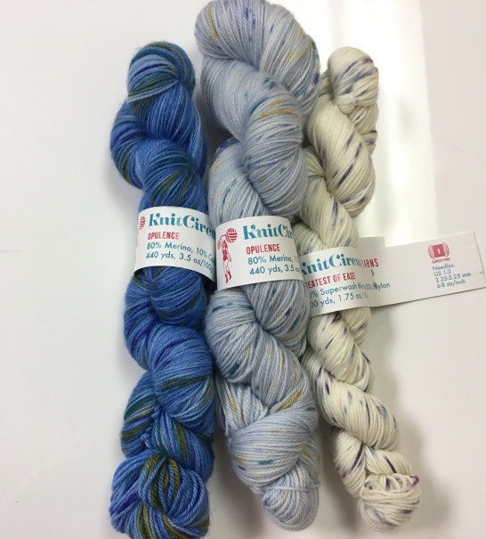
If you want to be a bit more adventurous, choose yarns that are not exactly the same color, but that all come from either the warm or cool side of the spectrum. Cool is blues, grays, greens and blue-purples like the group shown above, with the lightest Mistress of Myself, middle Cloud Nine and darkest Great Blue Yonder.

The warm side of the spectrum includes reds, pinks, red-purples, warm browns, yellows and oranges. You can see that the three colors above don’t exactly have matching base colors, but there are coordinating elements from each (the purple in the middle Fig & Prosciutto shade goes with the darkest shade, Don’t Fence Me In and the pink speckles in the lightest color Moonrise Kingdom echo the pink in the middle shade. The fact that they’re all warm colors makes the color story stronger.

Here’s a more adventurous palette blending two different dyers’ yarns. These have disparate base colors, but all share elements of warmth.
Play around with your own stash skeins to create gradient warm and cool color stories you’ll enjoy knitting!
Jaala